Feature Focus: Impactful chart visualisations

Certain types of data are much better visualised using a chart. For example annual comparisons are much better plotted using a trendline. This is why Polimapper has introduced its charts feature, so you have more flexibility to ensure your data makes the biggest visual impact. And ultimately create impactful key takeaways for your stakeholders.

Release Notes: Version 2.3.1

The latest version of Polimapper includes a number of significant improvements across the front-end and content management system. PDF downloads PNG exports Data driven narratives Chart wizard Map key modifications We will be taking a more in-depth look at each one of these in turn in the coming weeks, but below is a brief overview…

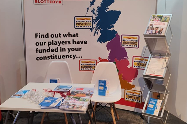
This year’s must have conference accessory

It’s striking walking around the exhibition at the Conservative party conference just how many stands utilise maps. Whether static or interactive, the value in using a map of the UK split into regions, local authorities or parliamentary constituencies in order to help shape a narrative is not in dispute among exhibitors at the conference. Especially…