
Case Study - YLvC

The Brief
Young Lives vs Cancer provides vital support to young cancer patients and their families during and after treatment.
Their research showed that on average, children and young people with cancer and their families travel 350 miles and spend £250 each month to receive their specialist treatment and care. Sadly, 71% of families are struggling to meet the cost of this travel, with 1 in 10 missing or delaying their treatment because they cannot afford the costs to travel.
We were tasked with mapping the distance from the centre point of a constituency to the closest principal treatment centre (PTC) for children and young people.
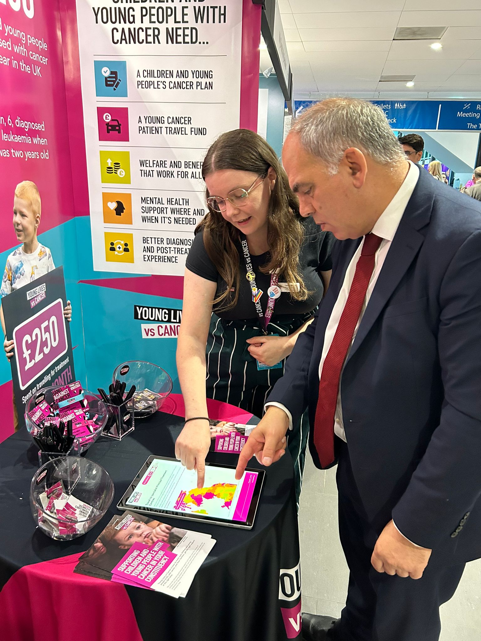
YLvC with Bambos Charalambous MP at the Labour Party conference [Photo courtesy of YLvC]
Research Phase
In total, there are 19 PTCs in the UK and 1 in the Republic of Ireland. We used QGIS software to determine the distance from the centre point of a constituency to its closest PTC – as the crow flies. We also identified constituencies whereby PTCs were separated by large bodies of water and selected the most reasonable PTC a child or young person would travel to.
“Its simple, interactive design has made sharing statistics and information much easier and enables us to ground our work in a way that is even more relatable to the stakeholder”
Visualisation
We mapped these distances using the following rank:
0-20 miles – short distance
20-40 miles – medium short distance
40-60 miles – medium long distance
60+ miles – long distance
When mapped, the distances were visually striking. The majority of coastal constituencies were more than 60 miles away from the closest PTC.
- In England, the majority of in-land constituencies were within a reasonable reach of the closest PTC whilst most coastal constituencies were more than 60 miles away.
- In Scotland, highland and border constituencies were often 60+ miles away from the closest PTC.
- In Wales, the majority of constituencies were 60+ miles away from the closest PTC, with a notable exception in the south.
- In Northern Ireland, the westernmost constituencies were 60+ from the closest PTC.

What motivated you to publish constituency data for your campaign?
We wanted to have a really visually striking way to show the scale of the problem we were trying to communicate to stakeholders, which is the distance and cost of travelling to specialist cancer treatment for children and young people. Not every constituency has a specialist treatment hospital in it, and as a result, many may be unfamiliar with the specialist care network and issues that this causes with travel distances and costs.
We decided that a map would be best for this, as it could very easily show stakeholders, for their constituency, what this looks like for them and explain the specialist care network much easier than without a visual aid.
“Polimapper has helped us take a more tailored approach to planning meetings and events with stakeholders”
Where have you used Polimapper?
We have used Polimapper at party conferences and in 1 to 1 meetings when engaging with stakeholders, and have linked to it in direct communications e.g. emails and briefings etc. We plan to embed this within our website as well as a next step. We also use it as an internal tool as a helpful quick constituency-specific reference tool.
How have stakeholders reacted to the data presented through Polimapper?
Stakeholders have responded well to the data presented through Polimapper, noting how it makes complex information easier to understand. This has been especially helpful at party conferences, where there’s often a lot of information for stakeholders like MPs to absorb, as the visual format stands out and grabs attention.
This has been a refreshing approach compared to traditional literature and helps stakeholders to take in the key points and have more productive discussions. Its simple, interactive design has made sharing statistics and information much easier and enables us to ground our work in a way that is even more relatable to the stakeholder.

How has Polimapper influenced your planning for meetings and events with stakeholders?
Polimapper has helped us take a more tailored approach to planning meetings and events with stakeholders. With quick accessibility to constituency-specific data, we’ve been better prepared to answer questions and share relevant information, making our interactions more meaningful and focused.
We’ve also included Polimapper links in engagement communications and briefing materials, giving stakeholders an interactive way to explore the data themselves. At events, we’ve used the map as a central focus where relevant, helping to guide discussions and highlight key points, making meetings more dynamic.